
Most people don’t grasp every reference in the MIT Press publisher logo, or “colophon,” at first glance. The symbol’s vertical lines are straightforward enough, but understanding what they represent requires the mind to fill in some gaps.
The lines create a lowercase m-i-t-p. They are made to look like book spines on a shelf. But they also resemble a barcode — which is remarkable considering the colophon was designed in 1963, before barcodes were widely in use.

Over the last 60 years, the design has stood the test of time as a distinctive and iconic logo for one of the largest university presses in the world. It has garnered accolades and inspired adaptations. Last month, it was acquired into the permanent collection of the Museum of Modern Art — becoming the only publisher logo to earn that distinction.
And it turns out filling in the blanks of the symbol’s history is just as interesting as the symbol itself.
A prescient designer
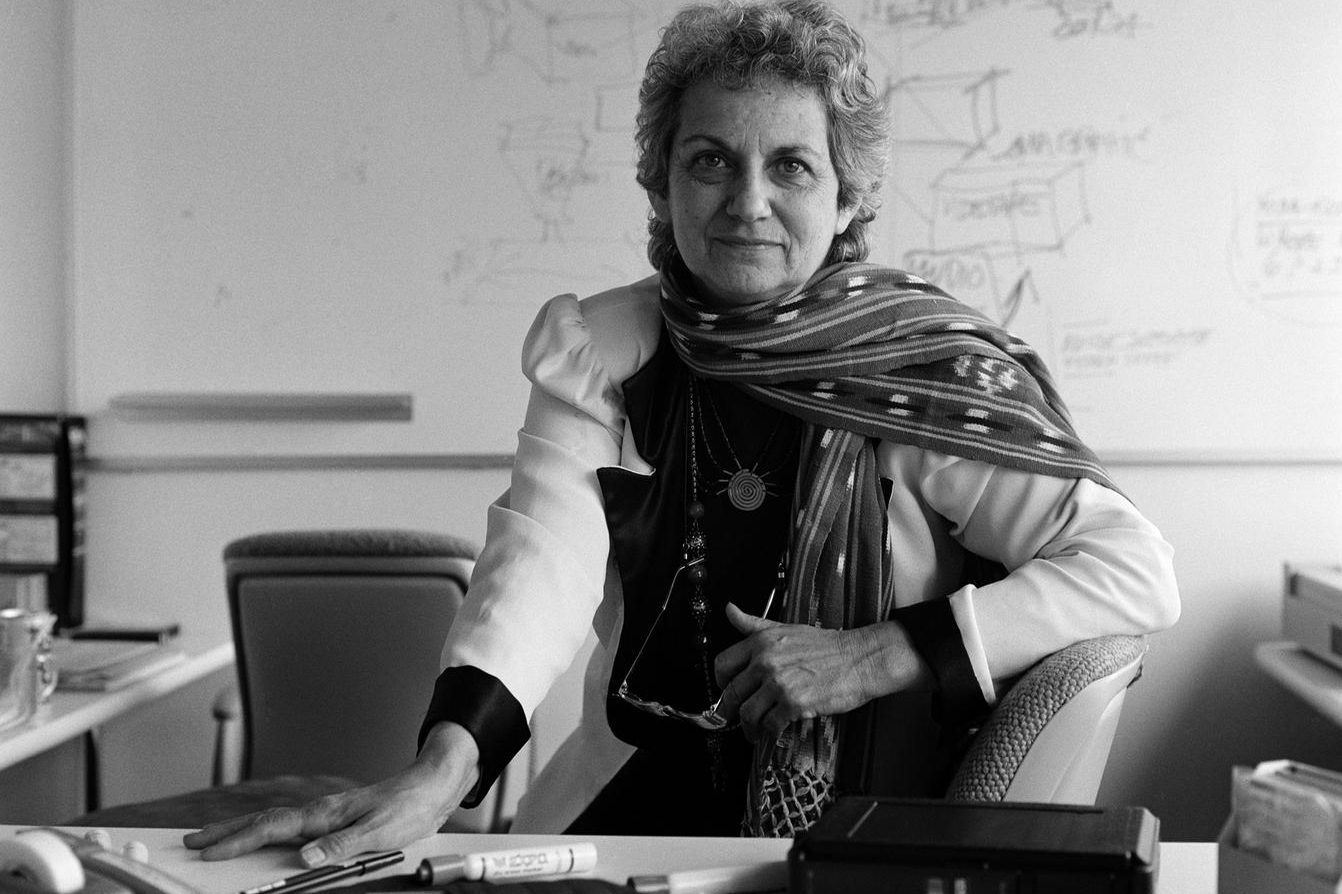
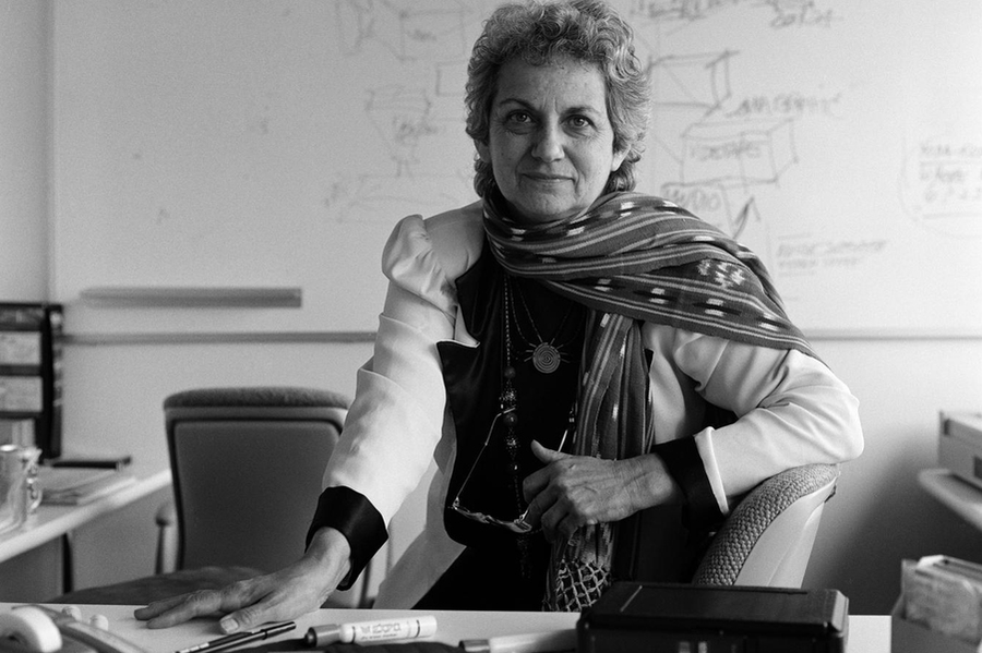
The logo is the brainchild of Muriel Cooper, a trailblazer in the world of design and an MIT legend in her own right. Cooper came to MIT in 1952 and spent the better part of the next 40 years working in different capacities at the Institute.
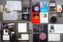
First serving as a freelance graphic designer for MIT Press, then called the Office of Publications, Cooper went on to become MIT Press’s design director, where she brought a modernist aesthetic to more than 500 books and invented new ways to use computer systems to design books.
“In each position she reinvented the terms under which she was working,” says graphic designer David Reinfurt, who co-authored a biography of Cooper with Robert Wiesenberger in 2017. “She was consistently interrogating the way graphic design is produced. She was restless and she was absolutely innovative in everything she worked on.”
One of Cooper’s early projects was to design the logo for MIT Press. Paul Rand, a famous designer who had created logos for IBM, ABC, and other companies, suggested Cooper for the job. The colophon Cooper came up with has been called a high-water mark for 20th century graphic design.
“The final design for the logo emerged from Cooper’s more literal and solidly midcentury drafts,” Wiesenberger says. “Indeed, Cooper’s clean logo belies her often messy, open-ended, and hands-on design process and pedagogy, and her own later challenges to modernist orthodoxy. Still, it travels seamlessly across those contexts and looks as fresh as the day it was made.”
Some believe the design’s resemblance to a barcode was no accident. In many ways, Cooper’s career was defined by the transition from print to digital design. It was a shift she saw far earlier than others: Cooper began experimenting with film and digital design in the 1970s and went on to found the MIT Visual Language Workshop, a precursor to the MIT Media Lab.
“The colophon also looks like a machine-readable graphic, a barcode, and I think that was intentional,” Reinfurt says. “When she got to MIT Press she realized the volume was such that she couldn’t be directly involved in designing every book, so she set up systems to produce books more efficiently. She started working with electric typewriters for typesetting very early, and she had a broad vision for how to take that volume of books and carry out a high level of design excellence through all of them.”
Design for function
Today the MIT colophon hangs subtly as part of a small sign over the MIT Press bookstore entrance in Kendall Square. Hundreds of people rush past it every day on their way to research labs, offices, and classrooms. Far more people see it when they buy MIT Press books, where it sits on the bottom of the spine.
“When you buy a book, you’re interested in the author or the subject, and you’re typically not thinking about who published it,” says Amy Brand, the director of MIT Press. “But our logo is so recognizable that people often notice it and think, ‘That means quality in the fields I’m interested in.’ The fact that it is iconic and distinctive really helps.”
Cooper passed away in 1994 at the age of 68. But in many ways the colophon embodies her broader design philosophy, and its continued use illustrates her ongoing legacy.
“One of the things Cooper is quoted as saying is, ‘Information is only useful when it can be understood,’” Brand says. “She was a force of nature in the relationship between design and information. She thought about it when she would design books and book covers — it was about making the information more understandable. All of that is encapsulated in the colophon.”