Typeface aficionados perceive major differences among fonts that look broadly similar to the rest of us. Now an MIT study suggests that when it comes to the typefaces used on auto dashboards, such differences might not be just an aesthetic matter, but a vital safety matter.
 In recent tests, researchers with MIT’s AgeLab have found that dashboard displays using the more open and differentiated lettering found in the “humanist” family of typefaces are easier for people to read quickly than displays using the more uniform and tightly spaced letters of the “square grotesque” style. Male drivers, in particular, can process messages in humanist lettering about 10 percent faster, on average.
That might not sound like a lot, but under highway conditions automobiles will cover about 50 feet in the time it takes drivers to process the less user-friendly messages. In some circumstances, that could be the difference between an accident and a near miss on the road.
“We’re not advocates of putting more information in front of the driver,” says Bryan Reimer, a research scientist at MIT’s AgeLab, and the lead author of an upcoming paper on the findings. Instead, Reimer says, the issue is, “How do we present the information that we do need in front of the driver in the most effective manner possible?”
The findings will be presented at a conference on computing and user interfaces, Automotive UI, being held this month in Portsmouth, N.H.
Bars, tails, curves and spaces
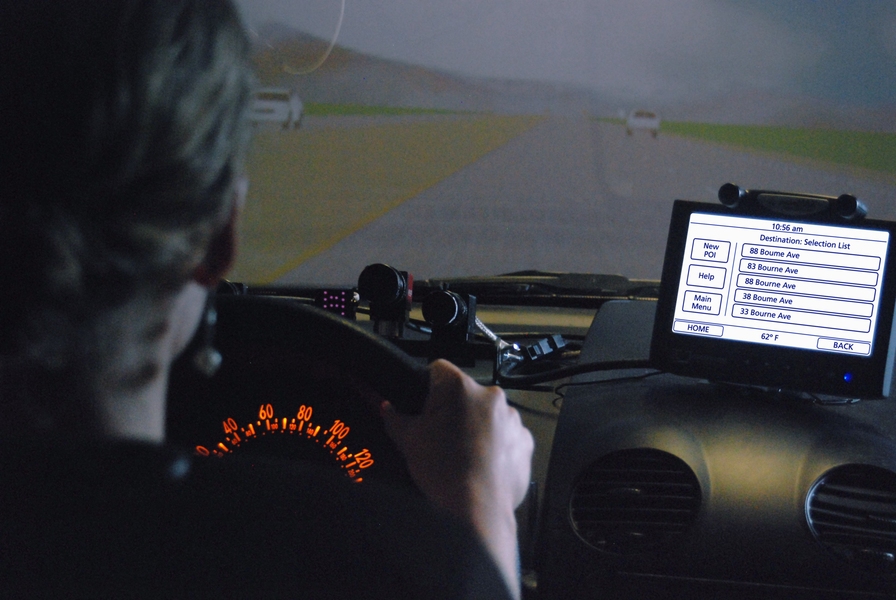
To conduct the study, the researchers performed two separate tests on drivers between 36 and 74 years of age. Subjects behind the wheel of the automobile simulator in MIT’s AgeLab were given displays using the two contrasting typefaces. In the first test, men took about 12 percent longer to process messages appearing in the square grotesque style, while there was little difference in the time it took for women to react to the messages. In the second test, in which only the brightness of the screen was changed, men took 9 percent longer to process displays in square grotesque, and women took 3 percent longer.
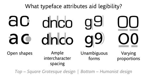
“You have two consistent studies telling you the same thing,” Reimer says. He suggests that the humanist style is easier to read quickly for multiple reasons: The narrower shape of the characters leads to greater relative spacing between them, making individual letters easier to distinguish. Also, the varying heights of the letters, and the distinctive tails and bars extending above and below the bulk of the character shape, “presents information in a manner that can be more quickly decoded” by drivers, Reimer adds.
The humanist style encompasses a variety of typefaces, such as Clearview, Veranda and Frutiger, the typeface used in the study. Grotesque typefaces include Franklin Gothic, Helvetica and Eurostile, which was the other typeface tested. “I’m not saying we need one typeface in the car, but the characteristics of one type style may be far superior to others for this application,” Reimer says, adding: “What’s optimal for a piece of paper or e-reader may not be optimal in a glance-based environment in the car. Immersive reading is far different than glancing at information for a few seconds.”
Graphic: Monotype Imaging
Part of the impetus for the study, Reimer explains, was to examine driver distraction in terms of the standard features of every car. While much public discussion about driver distraction concerns behind-the-wheel activities such as talking on cellphones or texting, dashboard displays are integral to every vehicle. The growth of in-car navigation systems, and the replacement of gauges with dashboard displays, may only increase the time drivers spend glancing at text while moving.
Other researchers in the field say the findings are valuable. "It's a well-done study," says Susan Chrysler, director of research at the National Advanced Driving Simulator, at the University of Iowa. Chrysler's own research on the typefaces used on highway signs has found that altering the fonts on signs produces an effect of similar magnitude, a correlation she finds "interesting."
And while the magnitude of the typeface effect is not by itself huge, Chrysler notes, every little reduction in driver distraction matters. "When you're trying to sneak a glance at the [dashboard] when you really shouldn't be, because of bad traffic, that's when 10 percent can really matter," she says.
The authors of the paper view their research as an initial finding that may spur additional studies in the same vein. That may include further analysis to see if the gender gap found in this study persists, and if so, what might explain it.
The research project fits into the broader concerns that AgeLab researchers have about the dissemination of consumer information at a time when the population as a whole is aging, adds Joseph F. Coughlin, director of the MIT AgeLab. “Font and presentation of information is going to become more critical in all domains of life,” Coughlin says.
Many of those older people are still driving. So for now, regarding cars, Reimer says, AgeLab researchers will continue to look for ways to optimize the devices already in automobiles. “How do we begin to be more effective at designing the vehicle?” he asks. “How do we look more deeply at the relationship between technology and the driver?”
In addition to Reimer and Coughlin, the authors of the paper are Hale McAnulty, Erin McKissick, Alea Mehler, Bruce Mehler and Ying Wang of the AgeLab; and Steve Matteson, Vladimir Levantovsky, David Gould, Nadine Chahine and Geoff Greve of Monotype Imaging, a typeface design and technology firm in Woburn, Mass. Monotype Imaging helped fund the studies.
That might not sound like a lot, but under highway conditions automobiles will cover about 50 feet in the time it takes drivers to process the less user-friendly messages. In some circumstances, that could be the difference between an accident and a near miss on the road.
“We’re not advocates of putting more information in front of the driver,” says Bryan Reimer, a research scientist at MIT’s AgeLab, and the lead author of an upcoming paper on the findings. Instead, Reimer says, the issue is, “How do we present the information that we do need in front of the driver in the most effective manner possible?”
The findings will be presented at a conference on computing and user interfaces, Automotive UI, being held this month in Portsmouth, N.H.
Bars, tails, curves and spaces
To conduct the study, the researchers performed two separate tests on drivers between 36 and 74 years of age. Subjects behind the wheel of the automobile simulator in MIT’s AgeLab were given displays using the two contrasting typefaces. In the first test, men took about 12 percent longer to process messages appearing in the square grotesque style, while there was little difference in the time it took for women to react to the messages. In the second test, in which only the brightness of the screen was changed, men took 9 percent longer to process displays in square grotesque, and women took 3 percent longer.
“You have two consistent studies telling you the same thing,” Reimer says. He suggests that the humanist style is easier to read quickly for multiple reasons: The narrower shape of the characters leads to greater relative spacing between them, making individual letters easier to distinguish. Also, the varying heights of the letters, and the distinctive tails and bars extending above and below the bulk of the character shape, “presents information in a manner that can be more quickly decoded” by drivers, Reimer adds.
The humanist style encompasses a variety of typefaces, such as Clearview, Veranda and Frutiger, the typeface used in the study. Grotesque typefaces include Franklin Gothic, Helvetica and Eurostile, which was the other typeface tested. “I’m not saying we need one typeface in the car, but the characteristics of one type style may be far superior to others for this application,” Reimer says, adding: “What’s optimal for a piece of paper or e-reader may not be optimal in a glance-based environment in the car. Immersive reading is far different than glancing at information for a few seconds.”
Graphic: Monotype Imaging
Other researchers in the field say the findings are valuable. "It's a well-done study," says Susan Chrysler, director of research at the National Advanced Driving Simulator, at the University of Iowa. Chrysler's own research on the typefaces used on highway signs has found that altering the fonts on signs produces an effect of similar magnitude, a correlation she finds "interesting."
And while the magnitude of the typeface effect is not by itself huge, Chrysler notes, every little reduction in driver distraction matters. "When you're trying to sneak a glance at the [dashboard] when you really shouldn't be, because of bad traffic, that's when 10 percent can really matter," she says.
The authors of the paper view their research as an initial finding that may spur additional studies in the same vein. That may include further analysis to see if the gender gap found in this study persists, and if so, what might explain it.
The research project fits into the broader concerns that AgeLab researchers have about the dissemination of consumer information at a time when the population as a whole is aging, adds Joseph F. Coughlin, director of the MIT AgeLab. “Font and presentation of information is going to become more critical in all domains of life,” Coughlin says.
Many of those older people are still driving. So for now, regarding cars, Reimer says, AgeLab researchers will continue to look for ways to optimize the devices already in automobiles. “How do we begin to be more effective at designing the vehicle?” he asks. “How do we look more deeply at the relationship between technology and the driver?”
In addition to Reimer and Coughlin, the authors of the paper are Hale McAnulty, Erin McKissick, Alea Mehler, Bruce Mehler and Ying Wang of the AgeLab; and Steve Matteson, Vladimir Levantovsky, David Gould, Nadine Chahine and Geoff Greve of Monotype Imaging, a typeface design and technology firm in Woburn, Mass. Monotype Imaging helped fund the studies.