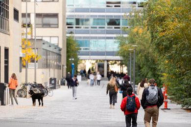
The “broken-windows theory,” which was propounded by two Harvard University researchers in the early 1980s, holds that urban “disorder” — visible signs of neglect, such as broken windows — actually promotes crime, initiating a vicious feedback loop. The theory was the basis for former New York mayor Rudy Giuliani’s crackdown on petty crime, but it’s come under sharp criticism from some social scientists. One of the difficulties in evaluating the theory is that it’s hard to quantify something as subjective as visible disorder.
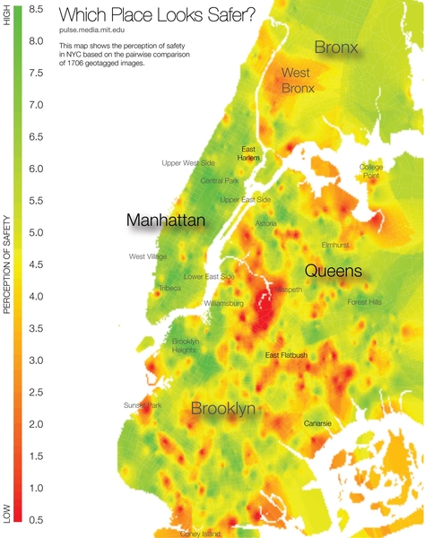
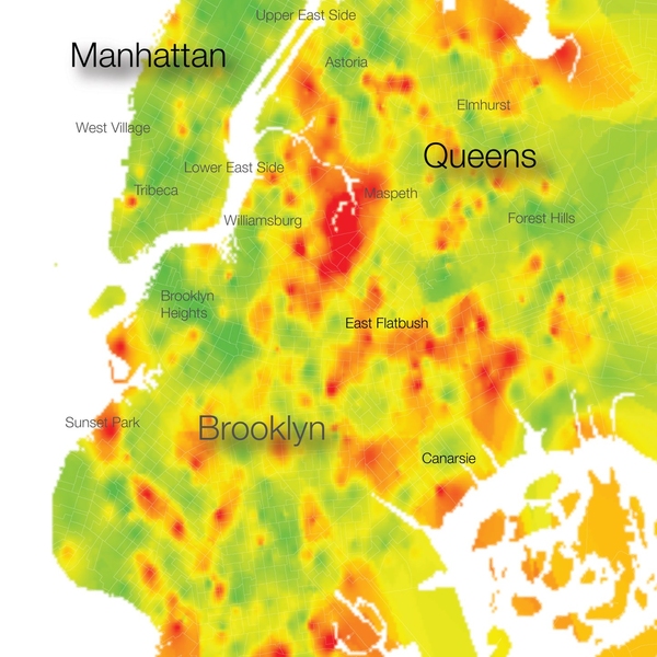
In the latest issue of the journal PLoS One, researchers from MIT’s Media Lab present a new online tool that they hope will help social scientists take a more rigorous look at city dwellers’ emotional responses to their environments. The tool presents online volunteers with pairs of images randomly drawn from Google Maps’ compendium of street-level photographs; each volunteer selects the image that better represents some qualitative attribute. Algorithms use the results of the pairwise comparisons to assign geographical areas scores, from one to 10, on each attribute.
In the experiments reported in the PLoS One paper, volunteers ranked the neighborhoods depicted in the images according to how safe they looked, how “upper-class,” and how “unique” — an attribute selected in the hope that it would not be strongly correlated with the other two. The researchers found that the scores for the U.S. cities selected for the study — New York and Boston — showed greater disparity between the extremes for both class and safety than did those for the two Austrian cities selected, Linz and Salzburg.
They also found that, controlled for income, area, and population, the perceived-safety scores for neighborhoods in New York correlated very well with incidence of violent crime.
Esse est percipi
But César Hidalgo, an assistant professor of media arts and sciences, who led the new study, says that measures of subjective impressions are most interesting when they are not simply a proxy for other data. The disparities between class scores in the United States and Austria, for instance, may not map onto similar disparities in some related statistic — say, average income in the same geographic regions.
“Income inequality is invisible if it’s in a bank account, but if it’s expressed in assets, as homes and cars, it becomes experiential,” Hidalgo says. “And the question for me is whether the experiences of inequality can elicit behaviors. I don’t have any evidence that this is the case, but at least I can show that some cities provide a more unequal experience. I can at least hypothesize that this might be something that explains social tension or social stress.”
While the initial study asked volunteers to rank neighborhoods in four cities according to three attributes, Hidalgo’s Macro Connections group has launched a website that will expand their data set, ranking neighborhoods in 56 more cities according to a revised set of five measures: how safe, wealthy, lively, depressing and boring they seem.
Hidalgo hopes that the type of data that he and his colleagues are collecting could ultimately help guide policy decisions. “One of the things that would be the most interesting in the long run is to overlay these maps with expenditures of government, narrowly defined by the things that affect how places look, such as repaving roads, building parks, or putting cables underground,” Hidalgo says. If visible neglect does, in fact, have an effect on social behavior, then, he says, investment in improved appearance should be greatest where safety — or some other attribute — is perceived to be lowest.
“My intuition is that these things aren’t going to be anticorrelated,” Hidalgo says, “and they should be.”
Jennifer Cowley, a professor of city and regional planning at Ohio State University, agrees that quantifying subjective impressions is a problem for social scientists. “That is why this work is so great,” she says. “By providing a very simple, intuitive-to-use tool, we gain, gather and undertake sophisticated analysis. We can identify all of the possible variables that influence perception and test these relationships.”
Indeed, Cowley has conducted her own studies using the system developed by Hidalgo and his colleagues. “In my first study using this tool, I was able to analyze the perception of people on the bikeability of different streets,” Cowley says. “I can imagine this having applications for natural landscapes, roadways and the built environment.”