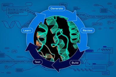
A redesigned MIT home page launched yesterday, featuring usability enhancements and a broader canvas for the popular central graphic.
The navigation has been expanded to include categories. For example, when you look under "Research," you can now search by topic, not just by lab or department name.
Other enhancements to the second-level pages include merging "Administration" and "Resources" into "Offices and Services," renaming "Campus Life" to "Community," and renaming "Academics" to "Education." These pages also have a new user interface that expands and contracts the lists.
The redesign was done by Suzana Lisanti and the Web Communications Services team in close collaboration with designers from Pentagram.
A version of this article appeared in MIT Tech Talk on April 2, 2003.


