For years, researchers at the MIT Media Lab have been developing a database of images captured at regular distances around several major cities. The images are scored according to different visual characteristics — how safe the depicted areas look, how affluent, how lively, and the like.
In a paper they presented last week at the Association for Computing Machinery’s Multimedia Conference, the researchers, together with colleagues at the University of Trento and the Bruno Kessler Foundation, both in Trento, Italy, compared these safety scores, of neighborhoods in Rome and Milan, to the frequency with which people visited these places, according to cellphone data.
Adjusted for factors such as population density and distance from city centers, the correlation between perceived safety and visitation rates was strong, but it was particularly strong for women and people over 50. The correlation was negative for people under 30, which means that males in their 20s were actually more likely to visit neighborhoods generally perceived to be unsafe than to visit neighborhoods perceived to be safe.
In the same paper, the researchers also identified several visual features that are highly correlated with judgments that a particular area is safe or unsafe. Consequently, the work could help guide city planners in decisions about how to revitalize declining neighborhoods.
“There’s a big difference between a theory and a fact,” says Luis Valenzuela, an urban planner and professor of design at Universidad Adolfo Ibáñez in Santiago, Chile, who was not involved in the research. “What this paper does is put the facts on the table, and that’s a big step. It also opens up the ways in which we can build toward establishing the facts in different contexts. It will bring up a lot of other research, in which, I don’t have any doubt, this will be put up as a seminal step.”
Valenzuela is particularly struck by the researchers’ demographically specific results. “That, I would say, is quite a big breakthrough in urban-planning research,” he says. “Urban planning — and there’s a lot of literature about it — has been largely designed from a male perspective. ... This research gives scientific evidence that women have a specific perception of the appearance of safety in the city.”
Corroborations
“Are the places that look safer places that people flock into?” asks César Hidalgo, the Asahi Broadcast Corporation Career Development Associate Professor of Media Arts and Sciences and one of the senior authors on the new paper. “That should connect with actual crime because of two theories that we mention in the introduction of the paper, which are the defensible-space theory of Oscar Newman and Jane Jacobs’ eyes-on-the-street theory.” Hidalgo is also the director of the Macro Connections group at MIT.
Jacobs’ theory, Hidalgo says, is that neighborhoods in which residents can continuously keep track of street activity tend to be safer; a corollary is that buildings with street-facing windows tend to create a sense of safety, since they imply the possibility of surveillance. Newman’s theory is an elaboration on Jacobs’, suggesting that architectural features that demarcate public and private spaces, such as flights of stairs leading up to apartment entryways or archways separating plazas from the surrounding streets, foster the sense that crossing a threshold will bring on closer scrutiny.
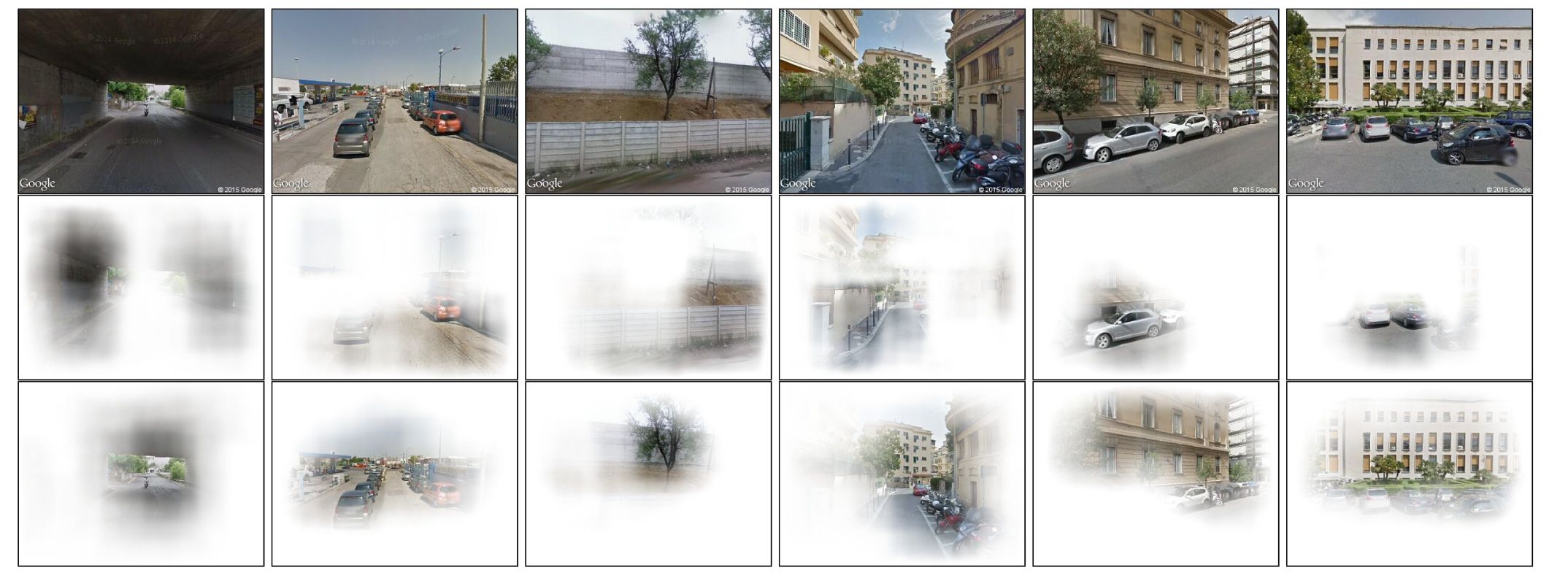
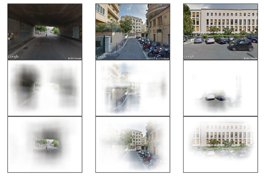
The researchers caution that they are not trained as urban planners, but they do feel that their analysis identifies some visual features of urban environments that contribute to perceptions of safety or unsafety. For one thing, they think the data support Jacobs’ theory: Buildings with street-facing windows appear to increase people’s sense of safety much more than buildings with few or no street-facing windows. And in general, upkeep seems to matter more than distinctive architectural features. For instance, everything else being equal, green spaces increase people’s sense of safety, but poorly maintained green spaces lower it.
Joining Hidalgo on the paper are Nikhil Naik, a PhD student in media arts and sciences at MIT; Marco De Nadai, a PhD student at the University of Trento; Bruno Lepri, who heads the Mobile and Social Computing Lab at the Kessler Foundation; and five of their colleagues in Trento. Both De Nadai and Lepri are currently visiting scholars at MIT.
Hidalgo’s group launched its project to quantify the emotional effects of urban images in 2011, with a website that presents volunteers with pairs of images and asks them to select the one that ranks higher according to some criterion, such as safety or liveliness. On the basis of these comparisons, the researchers’ system assigns each image a score on each criterion.
So far, volunteers have performed more than 1.4 million comparisons, but that’s still not nearly enough to provide scores for all the images in the researchers’ database. For instance, the images in the data sets for Rome and Milan were captured every 100 meters or so. And the database includes images from 53 cities.
Automations
So three years ago, the researchers began using the scores generated by human comparisons to train a machine-learning system that would assign scores to the remaining images. “That’s ultimately how you’re able to take this type of research to scale,” Hidalgo says. “You can never scale by crowdsourcing, simply because you’d have to have all of the Internet clicking on images for you.”
The cellphone data, which was used to determine how frequently people visited various neighborhoods, was provided by Telecom Italia Mobile and identified only the cell towers to which users connected. The researchers mapped the towers’ broadcast ranges onto the geographic divisions used in census data, and compared the number of people who made calls from each region with that region’s aggregate safety scores. They adjusted for population density, employee density, distance from the city center, and a standard poverty index.
To determine which features of visual scenes correlated with perceptions of safety, the researchers designed an algorithm that selectively blocked out apparently continuous sections of images — sections that appear to have clear boundaries. The algorithm then recorded the changes to the scores assigned the images by the machine-learning system.